About Me and This Website:
The official competion of this website was on 11/4/17
This website functions to project my love for both calligraphy and programming, filled with what I consider to be intriguing and wonderful short stories I've come across as well as eloquent quotes. All art radiates with emotion and narrative. Art is anything the spectator looks at with the intention of looking at art
I think of my offhand flourishes as nothing less than a shimmering iridescence of motionless movemenet and color, with each line having purpose and direction. Anything I chose to transcribe in broad edge is a great story or thought provoking idea I think needs to be spread, when I pracice my penmanship, the letters appear on the paper with a living utterance of illustrtion and text. It is almost strange, 'that the mere identity of paper and ink should be so powerful, the same thoughts become cold and ineffectual in being typed.
Extra Information:
This is a section dedicated to explaining anything that is not made clear throught the website or subjects that are just interesting to know.
Terminology:
- A flourish is a decoraion on a letter.
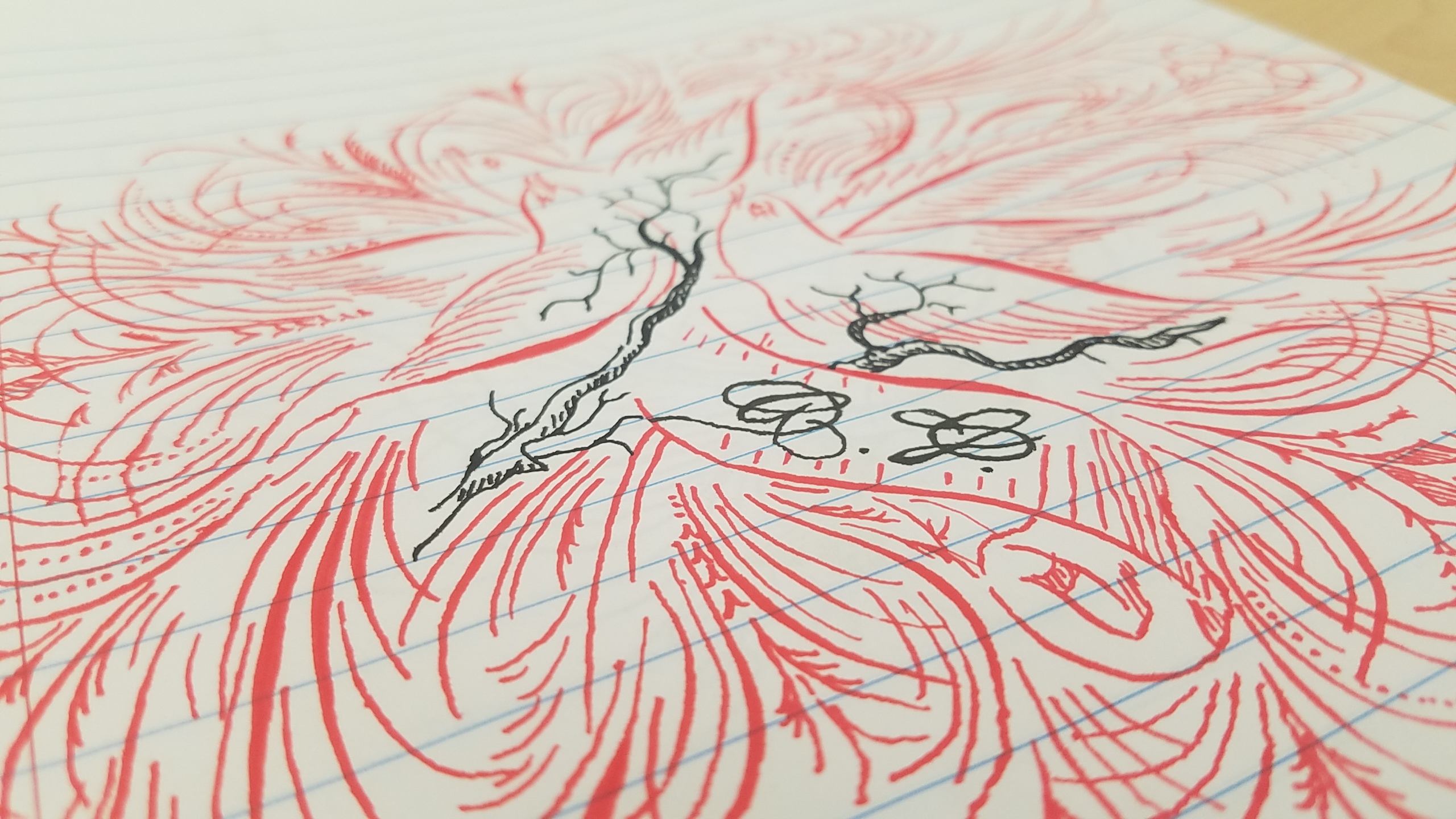
- Offhand Flourishing is flourishing without letters or words. Decorations made in such a way as to form an image, usually of a bird, but can also be of feathers or swans, any other depictions are very infrequent.
- Penmanship is text written in such a way as to utilize weight (wide parts and thin parts) in letters. Usually written with a pointed pen but can also be written with a brush or brush pen.
- Ornamnetal Penmanship is decorative penmanship, or writing with many flourishes
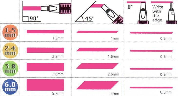
- Broad edge calligraphy refers to the use of a broad edge pen, with which the wodth of the line changes based on the angle at which you hold the pen in relatin to the paper. What classifies a pen in this category is a very flat nib, creating very broad lines on down strokes and very thin lines on side strokes.
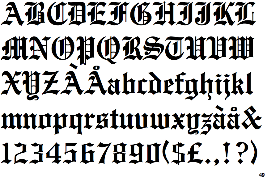
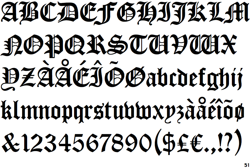
- The 3 main styles of broad edge calligraphy are Gothic, Roman, and Italic, and within each style there are many more fonts. My personal favorite gothic font is Cloister Black.
Pointed dip pens have 2 parts, a nib, and a holder. the nib gets dipped into the ink and writes on the paper. most nibs have 2 tines, which ink flowss through to get onto the paper, and when pressure is applied, the tines spread apart and create a widr line, this prperty is called flex. Different nibs have varying amounts of flex, different nibs also have varying line widths when no pressure is applied, this is called a 'hairline' has to do with the sharpness of the nib, however if the nib is too sharp then it will cut into paper on every up and side stroke and that is not good because the nib becomes difficut to use and gets caught on the paper. Usually more flex results in a thicker hairline, and very thin hairlines are associated with less flex. Thinner/finer hairlines look better than broad hairlines and more flex is almost always favored over less flex, so it is either a matter of finding a balanced nib, or finding a specialized nib for the task you have at hand (e.g. big or small writing). Smaller wriing looks better with finer hairlines and mre flex, while larger writing is the opposite.
The pen holder holds the nib in place. Oblique pen holders are very popular because they hold the nib a 45 degree angle, this makes it easier for the penman to write at the optimal angle for the script they are trying to achieve. With an oblique pen holder, the penman does not have to turn their body or the paper to write at an angle. Copperplate script, the most well known script is at a 55 degree angle, Spencerian script, the very first pointed pen script is based off a 52 degree angle to the line on which you are writing on, and my personal favorite script, Madarasz script, is written at a 57 degree angle. A trained eye can spot the difference in so much as a degree and identify scripts by it.
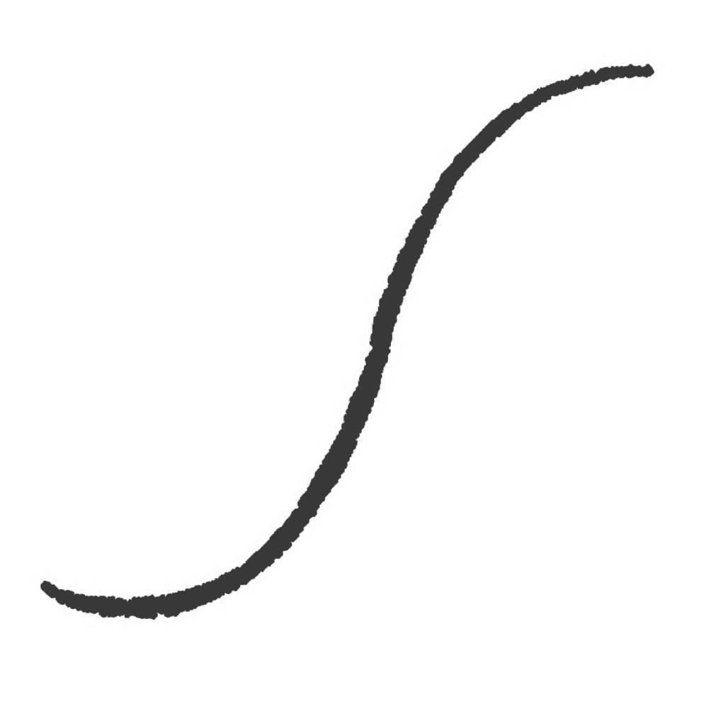
Fun fact, the universal line of beauty is a core component of most letters in most scripts and is the first stroke drawn in any letter that is is in. Any font that utilizes the universal line of beauty has it, or variations of it in 14 of the 26 letters such as B, F, and T. Mastering this line is the first step in achieving proficiency in general penmanship.